Social Media: Can Broken be Better?

A while ago I noticed something slightly broken about the StumbleUpon toolbar. The send-to function doesn’t always make it all the way through to the recipient. It can take hours, or seem to vanish completely.

StumbleUpon Toolbar with sent page waiting
StumbleUpon Toolbar with a sent page waiting

Social Media, Social Testing

I got online with a few people I follow through StumbleUpon and sent some pages back and forth. Paul of North South Media was the first. We refreshed views, re-started browsers and rebooted to no avail, off and on over a few hours. Many hours later the pages started to trickle through. Paul was curious about what happens between different time zones, and at peak Internet use times. The commute between the west coast of the US where I am and the Scottish “back-back” where Paul lives shouldn’t be too awfully rough for a little digital blip between people who are not on dialup, but a mystery is a mystery and I was off to see what I could see.

I tried the same thing with Emory of Clickfire. Emory is in Georgia, only three time zones away. Some of our messages got through within twenty minutes or an hour, and some seemed to vanish until the next day. Better, but still mysterious.

My next willing victim was Moojj, also known as Adam of Adamant Solutions, creator of the StumbleUpon Alerter. Adam is a gazillion time zones away from me, in Australia. He did not believe that sent-to pages were getting lost somewhere. His theory was that if it seemed not to go through it was actually just not showing up for some reason.

Voila. We sent our pages to each other. I saw nothing. He saw nothing. He tried clicking on the “Stumble” button, and my page and message appeared. The same thing happened on my end. Mystery solved: the sent page is sent and received almost instantly, but if it’s stuck in the toolbar you won’t see any sign of it unless you push the Stumble button.
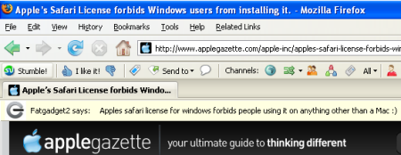
a sent Stumble arrives
Clicking on the Stumble button reveals a waiting page from Fatgadget2

When something doesn’t fit I start to wonder. This time I’m wondering if there are cases where less functionality is better. Does slowing down SU help keep it more civil and less competitive? More share-friendly?

Is Gently Broken Better?

Humor me for a minute. If users (and bots) had full access to who responded to a SU thumbs-up request and how long it took to get what kind of action from users with certain characteristics, would that make the users who are the most willing to be “nice” into targets for spammers? Yes, if bots got into the system, I think it would. Maybe, for the good of the users, some information is better off shrouded in unreliability… not too awfully shrouded to the point of bad usability for the devoted users, just gently broken here and there from the perspective of a marketer who is looking to do more using than joining in.

Leaving it a little bit broken makes taking the time to make a real human connection even more important. For instance, to get a screen shot of the incoming sent page I used above, I sent a pm to Fatgadget2. I am more likely to look at a page that comes from someone whose SU reviews I am subscribed to. Without a note, I would have seen who sent it, but getting it wouldn’t have felt as… human, especially if the page was lumped in with all the other Stumbles I could go to via the toolbar.

SU received page without a note
Received page without a note

Are there things about your favorite Social Media application that you would like to see ever so gently broken?

Skip To My Content

One simple feature can help users get into your site. Without this feature there is a barrier on every page. Some users will pass this barrier without noticing. For others, this barrier is a significant usability problem.

I’m talking about skiplinks.

Imagining Skiplinks

Look at the three links at the top right of this page: Skip to Content, Skip to Navigation and Skip to Footer.

Refresh the page, and without clicking anywhere put your mouse aside until the end of this section. I want you to pretend to be legally blind. You’ll be navigating via keystrokes. Using a mouse makes no sense if you cannot see.

To help un-visualize the process of “seeing” a web page visually, pretend to hear with your eyes. Imagine that your information comes in through hearing.

Push on the tab key, notice which link is now highlighted and imagine you’ve just heard a screen reader say the highlighted link text: Skip to Content. Push Enter and you’re at the start of the first article on the page. That is what a skiplink should do.

Let’s try this again, imagining that there are no skiplinks. Refresh the page, and without clicking anywhere put your mouse aside. Push on the tab key, again and again, noticing which link is highlighted each and every time. Imagine that each link’s link text is read out loud as you tab to it. You learn about the existence of that link as it is read aloud.

Your goal is to find and read the main article and any comments at the end of the article, by clicking on the permalink. In my blog, the permalink is the title of the post. You may or may not know that. In my current layout, if you are attempting to do this by waiting for a screen reader to read off all of the links on a page, you will need to listen to about 50 links before getting to the article. Imagine doing something like this on page after page, working your way through 50 or so links before getting to the article.

What a nuisance, eh? Through this very rough example, you’ve just scratched the surface of imagining something like the process of accessing a blog post with the help of adaptive or assistive technology.

Disclaimer – observing an expert screen reader moving smoothly through an accessible site is a completely different experience.

Three Points About Skiplinks

  • Skiplinks are also useful for people attempting to access a site on a mobile device such as a smart phone. Got skiplinks? Skip a whole lotta scrolling.
  • Power users who can make their screen readers dance on a dime still swear by the humble skiplink. Imagine what skiplinks could do for beginners
  • Skiplinks are easy to add. Easy.

Skiplink How-to Example

Make an unordered list of three or four items, starting with the most commonly sought item on the page. I like to start with “skip to content,” followed by “skip to navigation.” Other possibilities are the footer, a contact page, an accessibility statement, and a site map. Just like in any other navigation usability niceness, the fewer links a user needs to get through before arriving at their destination, the better.

The HTML – A framework

This goes in your header, right after the body tag opens.

 
<div id="skiplinks"">
<ul>
<li><a href="#content">Skip to Content</a></li>

<li><a href="#navigation">Skip to Navigation</a></li>
<li><a href="#footer">Skip to Footer</a></li>
</ul>
</div>
 

Next, you’ll need destinations for your anchors. If you’re using WordPress, you may need to add a “content” destination to index.php and single.php, and even archives.php. “Navigation” usually goes at the top of sidebar.php, and footer.php (of course) is a good place for a “footer” destination.

However, before adding destinations for those links, check to see if your theme already has them. My current theme for this site already had IDs named “content” and “footer.”

If you already have one of these:

 
<div id="footer"></div>
 

You don’t need one of these:

 
<a name="footer"></a>


You can make a quick check of your site by trying out the links in your address bar. Navigate to your site and add #content after whatever is in your address bar, leave the cursor in the address bar, and then press “Enter.” No movement, no #content destination on the page.

Some themes use #content for a wrapper that goes around both a sidebar and an article area. Make sure that your “content” skiplink’s destination is really the start of the article area in your theme.

If you anticipate needing a “return to top” link, consider use “top” as the name for the skiplinks ID, to give a built-in destination for those links.

CSS – A place for everything; everything in its place

The styling I’m using on this site right now is one way to go.

 
#skiplinks {
          width: 100%;
          background: #fff;
          clear: both;
          text-align:right;}

 
#skiplinks ul {
          text-align:right;
          width: 750px;
          margin: 0px auto;}

 
#skiplinks li {
          background:#fff;
          text-align:right;
          display:inline;
          list-style-type: none;}

 
#skiplinks li a {
          color:#000;
          font-size:.8em;
          margin: 0 .25em;
          text-decoration: none;
          font-weight: bold;}

 
#skiplinks li a:hover {
          background-color: yellow;
          color: blue;}


As always, your mileage may vary. Fine tune styles and html placement to suit your site.

Hat tip to Jeffrey Zeldman – The no access road

Blog Love, at a Glance

I often look at up to 100 blogs a day, many of which I have never seen before. That’s a lot of skimming. I don’t read all that I see. What makes the difference between reading and not reading, subscribing and not subscribing? It depends. Here are some of the at-a-glance things that make a difference to me personally.

Basics at a glance

  • Nothing is broken at a glance, especially images. Text that overlaps because of a lack of cross browser compatibility a kiss of death for web dev or design oriented sites.
  • Formatting makes content more digestible. No mammoth bricks of text without line breaks, no walls of all caps or squishy tapestries of all italics.
  • Spelling says the writers respect the readers. Perfection is nice, but not essential. Lots of really bad spelling is not excusable.
  • Navigation pays attention to my convenience. The site provides easily spotted labels for things I might want. It’s organized and not too cluttered to see.
  • The site is secure enough to self promote, but does it with some grace. They give me content before ads. If there is a big block of AdSense at the top of the content text my first suspicion is that I’ve landed on a scraped site. Another bad sign is ads that are formatted to look like they could be navigation links – instant lack of trust.
  • I trust them. Trust is a holy grail. Required reading – Stanford University’s Web Credibility Project.

How long have they been around?

Show me a dated archive. A yard of months and years in the sidebar feels like a waste of precious space. On my own blog, I’d rather have another slot for a blogroll link than a link to yet another month, because a blogroll supports a feeling of community and provides more insight for readers.

Site maps are a handy way to quickly see how long a blog has been around, and how often it has been updated. XML site maps are nice for spiders. I’d like one for me, too, please.

How often is it updated?

Give me a way to see at a glance how many posts are recent, and if the site has come back from previous breaks from blogging. Something important once a month is better than frequently posted dribs and drabs.

Can I tell what they think?

Annotations of what others have written will not keep me on a site, no matter how smart or well connected the writer was to pick up on the topic.

What topics are covered?

Show a category list. I may or may not use it for browsing. A blog category list that I can browse as a new reader gives me a chance to be tempted by topics beyond the last few posts that are visible on the front page. A category-based archive is more helpful to me in frequently updated blogs where front page material cycles through quickly. If this is SES recap week and I have other interests, give me a way to see what else the blog is about, and what the writers care about.

Should a category list show how many blog posts there are in each category? I used to think that tucking those numbers after this, that and the other looked cluttery. After browsing a few hundred blogs I’ve changed my mind, in the case of category tallies. Numbers show a pulse at a glance.

Am I reading a current post?

The date should be readily available on each post. Don’t make me hunt for the “permalink” in order to find out that a post about last year’s search rank shifts is not about what’s going on with me this week.

Is there a committed readership?

Readers count. Lately, I find myself attracted to recent comments widgets. A most commented widget would give an idea of what posts have been hot with readers. Showing top commenters could be a way to encourage readers to compete for the top of the heap, though quantity doesn’t necessarily mean quality.

Things I Thought Would Matter, But Don’t

  • Looking official can be a disadvantage if “looking” like the real deal makes it look like every other site that’s trying to do the same thing. Bloggers should consider using a custom theme.
  • Displaying credentials is nice, but not essential. If the people behind a site have mad skills but can’t write, I’m not going to read them. Sites with a first rate pedigree and third rate bloggers are better off not trying to fake it.
  • Avoiding personal content on a business site may be a mistake, within reason. I *want* to see enough to make it personal, especially in a blog. As a customer, I’d want to know the site’s bloggers have a clue about what is important to my audience. Go ahead and get personal. Just don’t whine, tell me about your bunions, or alienate me with political or religious rants that indicate that you as an individual would not respect me and my different views — unless you’ve got a site about politics, religion and bunions, in which case, farewell and I wish you luck. Stick to what helps me understand what is connected to your message.

A Defined and Navigable Space

My 100 posts project needs a home. I want all 100+1 in their own group, with easy navigation between them, and I’d like some sort of countdown widget.

For a countdown I chose KB Countdown Widget.

KB Countdown Widget

KB Countdown is a sidebar widget that comes with nice documentation and several pre-configured options. You can even add html. My only complaint is that because of this plugin I didn’t have a reason to learn to write the php myself, but, hey, it’s done today instead of later, so I think I’ll live. You can see it in action at the top of my left column.
By Adam R. Brown.
Configure at Presentation > Widgets.

Count the years/months/days since, until, or between events. Optional bar graph for tracking progress between two dates.

Adding Tag Tags to a WordPress Theme

I want each post to show a list of any associated tags. I think the end of the post is the best place for a list of tags, and because categories are the big stuff of what the post is about I’m going to leave categories at the top. Tags feel more like a “related posts” sort of a thing, which is more expected at the bottom of a post.

According to the codex, to add a list of tags that are associated with a specific post, I need to use the following:

<?php the_tags(); ?>

First available with WordPress Version 2.3, this template tag displays a link to the tag or tags a post belongs to. If no tags are associated with the current entry, the associated category is displayed instead. This tag should be used within The Loop.

The WordPress Codex on the_tags

To list the tags at the end of a post, paste

<?php the_tags(); ?>

after

<?php the_content(__('Read more'));?>

and before

<?php endwhile; else: ?>

In my theme I only needed to add it to index.php. In yours, you may also need to do the same to single.php. Here’s what it looks like in my index.php:

<?php the_content(__('Read more'));?>
<div style="clear:both;"></div>

 
<?php the_tags(); ?>
 
	<?php endwhile; else: ?>

 
<?php _e('Sorry, no posts matched your criteria.'); ?>
 
<?php endif; ?>

<h2>Comments</h2>
 

If you try adding this code and nothing shows up, check to make sure you’ve added it before the endwhile; else: bit that marks the end of The Loop.

Adding Previous Post and Next Post Links

To help people cycle through my series, today I added links for going backwards and forwards between posts. The WordPress Codex has some straightforward examples of how to use next and previous links.

This is the basic code:

<?php previous_post(); ?>    <?php next_post(); ?>

The parameters for both of these tags are format, text and title. These parameters should be separated by commas and enclosed in apostrophes. I made use of them like so:

I chose to insert two pair of left angle brackets, followed by the permalink: '« « %'

Add “Back” and a colon: 'Back: '. If no link is present, no “Back” and colon will show. To make it clearer exactly what these links are, I have labeled them with “back” and “next.” Other choices are words like “previous” and “forward,” but my command decision of today is that I like “back” and “next” because they are nice and short.

Use the title: 'yes'

So far, we have this:

<?php previous_post('&laquo; &laquo; %', 'Back: ', 'yes'); ?>

<?php next_post('% &raquo; &raquo; ', 'Next: ', 'yes'); ?>

Because some of my titles are long enough to trigger a line break, I want a line break between my longer previous post and next post links. Also, I think they’d be a little easier on the eyes if “Back” floated to the left, and “Next” floated to the right. I used floated divs for this, choosing not to add a class to my stylesheet because it wouldn’t cut down on the amount of code. If you do a View > Source and this is no longer so… well, could be that I changed my mind. ;-)

 
<div style="float: left">
<?php previous_post('&laquo; &laquo; %', 'Back: ', 'yes'); ?>

</div>
<div style="float: right">
<?php next_post('% &raquo; &raquo; ',
 'Next: ', 'yes'); ?>

</div>
 

Tuck it in between

<?php the_tags(); ?>

and

<?php endwhile; else: ?>

and I’m done with the previous and next post links.

Voila. Home sweet 100+1 post home.