Fix Broken Permalinks after WordPress 3.2.1 Upgrade

Have your blog traffic stats taken a tumble after upgrading WordPress? Mine did, after upgrading to WordPress 3.2.1. The fix may be easier than you think. Re-save your settings – that’s all, folks! Easy peasy.

If the only thing that’s different is a WordPress upgrade, this should help. If there have also been plugin updates, try uninstalling plugins. Especially, check the settings on SEO plugins that try to cut down on the number of duplicate pages created via archives. For instance, if you disable date-related archives and then add an “Archives” widget to your sidebar, the links will show in the widget, but they may not behave normally.

If links to pages you know exist are there showing up as “not found,” your permalinks may be broken.
Go to Settings > Permalinks and click on “save.”
Is your 404 page not working, when everything was fine before an upgrade?
Go to Settings > General and click on “save.” This can re-set your htaccess file.
Now that WordPress has re-learned your permalink structure, remind your XML and HTML sitemaps to do the same.
Go to whatever sitemap generator(s) you are using and click on “save settings.”
Are you getting an error about not having php5, though your host has had it working just fine?
Add instructions to the end of your htaccess file:
# END WordPress
Options All -Indexes
AddType x-mapp-php5 .php
AddHandler x-mapp-php5 .php

This same sort of re-saving can help to clean up little snaggles after a server move.

Developing a WordPress Wireframe

The WordPress Default theme can provide a jump start for developing a WordPress wireframe. Because it has a good selection of template tags already worked into the theme, a quickie clickable prototype blog theme is only a few simplifications away. After the first WordPress wireframe, creating alternative wireframes from the original is a simple process.

What is a Wireframe?

A web site wireframe is the simplest possible map of a new site design. At the most basic level, a set of napkin drawings can be enough of a wireframe to get you started. For more complex sites, a clickable wireframe can become a proving ground for how to integrate a flow chart of user interaction goals into a web design.

The more fine tuning you can do in a wireframe, the less repetitive reworking will be needed down the line. Wireframes can:

  • Save time – wireframes can save hours, days, weeks, of frustrating re-working. Some web developers credit wireframes with a 30-80% time savings.
  • Provide a spatial orientation – without preconceived limitations, ideas may flow more freely.
  • Focus on functionality – avoiding distractions such as color choice, until surface-level branding ideas are finalized.
  • Help prioritize work flow by leaving underlying technical complexities until establishing a solid foundation
  • Separate different kinds of tasks – prevent the development of graphics, programming and guiding user traffic patterns from competing with each other

Exactly is how all of this possible? Imagine wanting to reduce the height of WordPress Default’s header image, putting in the time to edit functions.php, style.css, and kubrickheader.jpg. A few days later someone has a brilliant idea that requires small though time consuming adjustments to everything you just did. A day after that everything needs to be changed again, because the sidebar will be a different shape. If those decisions had been made at a wireframe level, reworking functions.php and kubrickheader.jpg could have been done only once or twice.

Some First Steps For Wireframe Design

  • Doodle
    Make simple drawings of web site plans, before changing anything that seems like it will be time consuming or complicated. Your perception of what that means will vary. Sometimes I’m more comfortable doing my visual thinking with CSS, and sometimes there is nothing like a set of “napkin drawings” to show me the potentials of a design idea or the errors of my ways.

  • Flow chart it
    Map out at least two possible user paths – one from a visitor’s perspective, and one that encompasses the site owner’s goals. What will users need, and what do a site’s owners hope they want?

  • Share or step back
    Seek fresh eyes, yours or a team member’s. Implementation after input is less painful than re-tooling ideas that are already developed.

  • Back up existing work
    Save potentially reusable code and de-stress mistakes. Back up any pre-existing theme as well as incremental changes as the wireframe develops.

  • Plan to comment liberally
    Oftentimes starting from scratch is more efficient. However, if I am starting with an existing theme that is not chaos incarnate, I like to comment my additions to any given line of a stylesheet with this:
    /* added */.

My Method: first steps for a wireframe based on WordPress Default

I want to free the eye from pre-concieved ideas and free myself from anything that would add work to making simple changes in a page’s structure. I also want to remove distractions. Any tendency for the eye to land on an area should be determined by where the strength of the design and the content meets predictable user behavior – consider eyetracking.

To accomplish this, I’m removing images, outlining areas with a defined width, and then adding a pale background to any content-defining areas that aren’t already outlined. Most of this can be done in style.css, but because of the way WordPress Default is set up there are a few special touches.

Wherever I wanted to change a line, I commented out the entire line. Where needed I added a second line with the comment “added.” I’m commenting out instead of removing, because I may want to backtrack or re-use what was originally there.

Removing Images

Taking out background images instantly frees me from needing to re-size them while futzing with resizing content blocks.

The WordPress Default theme includes six images, controlled with three methods:

  • Controlled with style.css:

    • kubrickheader.jpg – the header image space, found in #header
    • kubrickbgcolor.jpg – a 60px square tile of background color, controlled by the body tag
    • kubrickfooter.jpg – the footer background, controlled #footer
  • Enhanced by functions.php:

    • kubrickheader.jpg – functions.php builds custom coloring for Default’s header image
  • Inserted by header.php:

    • kubrickwide.jpg – background for centered single post pages without a shaded sidebar
    • kubrickbg-ltr.jpg or kubrickbg-rtl.jpg – background for left-to-right or right-to-left text, with sidebar.

Step-by-step

  1. Go to Design > Theme Editor, then choose style.css and comment out the lines of style.css that mention kubrickheader.jpg, kubrickbgcolor.jpg and kubrickfooter.jpg.
  2. Remove custom coloring by going to Design > Header Image and Color, then choose Select Advanced > Select Default Colors, and Update Header.
  3. From Design > Theme Editor, choose header.php, then look for and comment out the following code. I used both html and php comments.
     
    <!--
    <style type="text/css" media="screen">
    
    /*
    <?php
    // Checks to see whether it needs a sidebar or not
    if ( !empty($withcomments) && !is_single() ) {
    ?>
    	#page { background: url("<?php bloginfo('stylesheet_directory'); ?>/images/kubrickbg-<?php bloginfo('text_direction'); ?>.jpg") repeat-y top; border: none; }
    <?php } else { // No sidebar ?>
    	#page { background: url("<?php bloginfo('stylesheet_directory'); ?>/images/kubrickbgwide.jpg") repeat-y top; border: none; }
    
    <?php } ?>
    */
    </style>
     
    -->
     

Adding Borders

Adding borders keeps me sane – I sometimes wish the rest of life was that simple! Once I knock in some borders I know at a glance where one item bumps up against another, and when switching between browsers I can see differences in display instantly. Borders do add to the width of a box, making for a slightly tighter space that can bump around the contents, but at the wireframe stage seeing that kind of thing is an advantage in itself.

Going back to style.css, I added borders to anything with an absolute width. Every border is a slightly different color. I like using pastel borders because they encourage my eye to wander. A mixture of dashed and solid borders helps me sort out where one box ends and another begins.

Here’s an example:

 
#footer {padding: 0;
	margin: 0 auto;
	width: 760px;

/* added */ border: 2px dashed #ffc06d;
	clear: both;}
 

Background Colors

I like to start with all white backgrounds, with an exception of a pale background color to indicate content chunks that are not defined by width. Whatever color I make an area in a preliminary mockup should not look like it will have an impact on user behavior. Having specific places for specific goods comes later.

After making the header background white, text that appears in that area will need to be something besides white.

Next Steps

Now that you have a fresh, blank slate, make a backup copy and think of three things:

  • Width – The displayed width of a site, from a user’s point of view, determined by a user’s screen resolution and whatever else they may like to have open alongside your site.
  • Height – The distance between the top of the user’s view and how far down they can see into your site before scrolling. Users should have a sense of what each individual page is about, before scrolling. Scrolling is not bad. Leaving users at loose ends is bad. Web design layouts should set up the presentation of web content in a way that orients users before scrolling.
  • Hooks – In the first fifteen seconds of looking at a page, what will make the reader want to stick around?

WordPress Default Single Post View With Sidebar

The WordPress Default theme doesn’t include a sidebar in single post views. I don’t like the way Default does this, for three reasons.

  1. Any page can be a landing page. A site should provide new users with whatever they may need in order to feel oriented. A few sidebar landmark links can do wonders for a bounce rate.
  2. All or nothing is not much of a choice. Suppose you want a sidebar that shows subcategories for the parent category of that post, or featured links for a category that is also the topic of some non-blog content “Pages,” or any number of other possibilities.
  3. Convenience. A centralized location for sidebar customization may provide better management. Some of this could be set up in functions.php and sidebar.php, instead of requiring separate edits on however many separate template files might have different kinds of sidebar situations. Which method is really more convenient will depend on what the blog is expected to do, and the person managing the customizations.

The following tutorial shows how to include a sidebar on the single post view of a site that uses the WordPress Default theme. The same method can be used for other sorts of single column views.

  1. Step One: Find “widecolumn” template files
  2. Step Two: Change body text placement
  3. Step Three: Add the sidebar

Step One: Find “widecolumn” template files

In the unedited Default theme, four kinds of views have the single column, sidebar-free presentation style. Each is created by a separate template file. I’ve chosen to add sidebars to three, but leave image.php as is. WordPress 2.5x’s image gallery is generated by image.php, and I want to get to know it before editing it.

From the WordPress dashboard, go to Design > Theme Editor and open these three files of the WordPress Default theme:

  • single.php
  • archives.php
  • links.php

On each of those template files you’ll need to change two, short, simple bits of code – one near the top of each, and one at the bottom.

Step Two: Change body text placement

Find references to the “widecolumn” class, and change them to “narrowcolumn.” “Widecolumn” arranges content in the single, wider column of WordPress Default’s sidebar-free pages. Narrowcolumn allows room for a 190 pixel sidebar with 15 pixel margins, and a 15 pixel buffer between content and sidebar.

Look for this near the top of each of the three files listed above:

 
<div id="content" class="widecolumn">


After changing “widecolumn” to “narrowcolumn,” it should look like this:

 
<div id="content" class="narrowcolumn">
 

Remember to click “Update File” to save your work.

Step Three: Add the sidebar

Add a sidebar. A call to a sidebar can be added just above the call to the footer.

Look for this near the bottom of each of the same three files:

 
     <?php get_footer(); ?>
 

After adding a call to the sidebar, it should look like this:


     <?php get_sidebar(); ?>
 
     <?php get_footer(); ?>


Remember to click “Update File” to save your work.

Check your work.

Open a post and click refresh.

without sidebar
Before: without sidebar
with sidebar
After: with sidebar

At this point, everything should be working as expected. If not, check your work and try again.

Show and Tell: Plugins for Testing and Changing Themes

There are three ways to get a peek at how pre-existing content looks on a theme: use a theme changer or a theme previewer on the blog’s current location, or install a copy of the content’s database in an alternate location. For some projects, setting up a theme switcher or preview utility can be a nice early step in developing a theme.

Today I’m looking at four plugins – one theme changer and three theme previewers. Each method has advantages and disadvantages. In my case a theme changer was the best choice, because I want to share the effect of design changes with my readers.


A WordPress Theme Changer Plugin

Why use a theme changer?

  • Allow clients to compare “live” design alternatives
  • Show off a WordPress theme portfolio
  • Demonstrate the impact of design changes
  • Entertain blog visitors

Considerations for effective use of theme changers

  • Readers may be confused. Help orient readers by putting theme changer links at the top of your sidebar, where they are easily spotted.
  • Limit installed themes to the choices you want to make available to users. All installed themes may be listed by a theme switcher.

Theme Switcher Reloaded Version 1.0

By Themebot.
Last Updated: 2008-2-22
Requires WordPress Version: 2.0 or higher
Compatible up to: 2.5x
Configure at Design > Widgets > Theme Switcher

WordPress Theme Switcher Reloaded is an updated version of the venerable Theme Switcher by Ryan Boren, and Theme Switcher Widget by Jared Bangs. This plugin was sponsored by Themebot and coded by kingler. The plugin is currently maintained by 72pines

Theme Switcher Reloaded

Theme Switcher Reloaded is currently in use on this blog. Those who install first and read directions later may have a confuzzled moment when looking in “Settings” for setup options. It’s not there. You need to activate the sidebar widget in Design > Widgets. After that, changing themes is extremely quick – I saw no noticeable difference in load speed, even when tested on dialup.

Theme names are appended to the blog’s root URL: http://yoursite.com/index.php?wptheme=Your+Theme+Name.
XHTML and CSS validators understand to use the files of whatever theme is appropriate for “Your+Theme+Name” when checking this style of Theme Switcher generated URL.


Previewing a WordPress Theme

The following three plugins allow previewing of themes that are not publicly active. Unlike the sidebar widget interface utilized by the theme switcher above, theme previewers are triggered by some sort of behind the scenes action.

Why preview an inactive theme?

  • Develop a theme before making it active
  • Collaborate with another designer
  • Scan for width-related content display issues before changing themes
  • Low pressure tweaking – do that one small thing without worrying over breaking anything in public view
  • Check for CSS inconsistencies – especially nice when changing from a static site with lots of inline CSS to using WordPress as a CMS
  • Check for elements in need of more detailed CSS styling, especially blockquotes and lists

Considerations for effective use of theme changers

  • Ease of use. How does the previewer change themes? Is it easy for you, or confusing?
  • Access. Do all registered users have rights to explore alternative themes?
  • Disable cache plugins. You may need to disable cache plugins before theme previewers will work.

Theme Test Drive Version 2.0

By Vladimir Prelovac.
Last Update: May 18th, 2008
Requires WordPress Version: 2.3 or higher
Compatible up to: 2.5.1
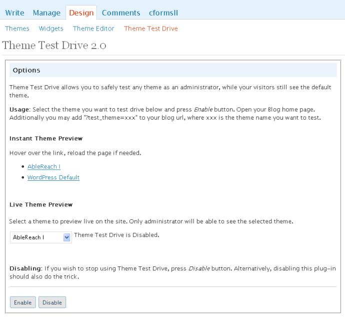
Configure at Design > Theme Test Drive

Safely test drive any theme while visitors are using the default one.

Theme Test Drive

Theme Test Drive options

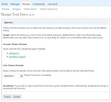
Only a blog administrator will be able to see previewed themes. Others will see the standard installed theme. I found this previewer to be easier to keep track of, because of seeing “enabled” or “disabled on the nifty thumbnail-enhanced theme preview page. This is the most idiot-proof of the theme preview plugins.

Theme Tester Version 0.3

By Donncha O Caoimh.
Last Updated: 2008-4-8
Compatible up to: 2.5
Configure at Design > Theme Tester

Allow an admin to test new themes without showing your blog visitors

Theme Tester

Theme Tester configuration

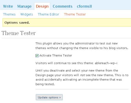
Theme Tester allows an admin to change and test new WordPress themes without worrying about showing visitors a half-finished theme. After installing the plugin, go to Design > Theme Tester to choose a theme to test. While the plugin is activated, a logged-in administrator can change themes as desired without changing the theme that regular visitors see.

Preview Theme Theme Preview Plugin Version 1.0

By Dougal Campbell.

Last Updated: 2007-10-27
Requires WordPress Version: 1.5 or higher
Compatible up to: 2.3.1 (tested here on WP 2.5.1)

Allows themes to be previewed without activation

Theme Preview Plugin

After activation, adding the query variables ‘preview_theme’ and/or ‘preview_css’ to
the current URI will change the theme that is displayed for you, without making any changes for other viewers. The trick is that you have to already know what to type. The bonus is an ability to swap out stylesheets, which can be an interesting way to go if you are working on stylesheets that can change the look of the same base theme.

Loads a theme located in the folder “my-theme”

?preview_theme=default

Loads the stylesheet from a theme located in the folder “your-theme” onto the currently installed theme

?preview_css=your-theme

Loads the “your-theme” theme, with the “my-theme” style sheet

?preview_theme=your-theme&preview_css=my-theme

I’ve used this plugin successfully on other WP 2.5.1 sites, but could not get it installed here, even after deactivating a few other plugins. If you’re into playing with your CSS, Preview Theme is very fun to use, and I’d recommend giving it a shot.

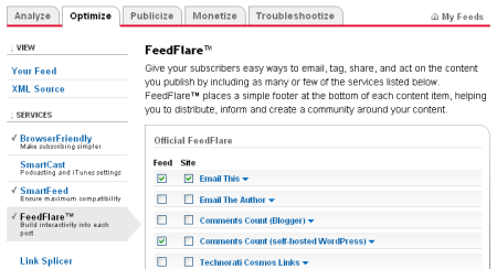
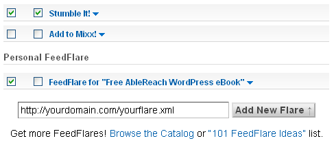
My WordPress Remodel series will continue on most Mondays and Thursdays, building towards an eBook about WordPress theme design. RSS feed subscribers will see a special link where they can register to get the ebook for free.

WordPress Remodel Begins With a Custom FeedFlare Lesson

From here on out until I’m satisfied I’ll be blogging through the process of revamping the WordPress Default theme into a new home for my blog.

unedited default theme
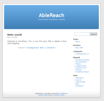
WP Default has good bones and was based on Kubrick, another theme with good bones; it will provide a good foundation. If I keep to the same CSS id names as Default, customizations I come up with can be more easily used by others. Also, starting with Default’s good use of WordPress’s hooks will be a smart way to dive into the power of the system.

Forecasting WordPress and Adventures Ahead

Expect WordPress posts on Mondays and Thursdays, and maybe a little more. You can already peek at the Default theme by using the theme switcher in my sidebar. Right now WordPress Default’s single post view has no sidebar. If in Default, clicking on the header will take you back to a view with a sidebar.

unedited default themeDefault will look pretty funky for a while. Image floats and widths are areas where you will see rough spots. In most browsers, too-wide images are compressed to make them fit. IE6 users will see images wider than 450px protruding into the sidebar.

Progress so far…

  • Installed an uncustomized version of the WordPress Default theme
  • Choose and installed a theme switcher.
  • Tested a theme preview plugin – look in the sidebar for links
  • Took floats out of inline styling on sidebar widgets
  • Added an eBook registration link to my feed

Having found a couple nice ways to switch back and forth between themes will make this process much more enjoyable. Tomorrow I’ll review the theme switcher and theme preview plugin. They’re both simple to install and easy to use.

Free eBook for Subscribers, as Promised…

After I’m done with the WordPress remodel I’ll offer up the whole series as an ebook. There will be a reasonable fee for the ebook. However (marketing alert) anyone who is subscribed to my RSS feed during the week of Mother’s Day (May 11-17) will see a special link where they can register to get the ebook for free.

Mom Remodels WordPress

For the next week or so, new RSS posts will contain a special Feed Flare link where RSS subscribers can register to get the eBook for free. When this series is done, the ebook will be compiled.

Writing a Custom FeedFlare

Day one’s biggest learning experience was how to add a nice email link to a FeedBurner FeedFlare.

I wrote and used a version of this simple static FeedFlare. Place the text below in a plain text file, customized for your needs, save it with an extension of .xml, and upload it to an accessible area of your domain. The hardest part was figuring out that I had forgotten to escape an ampersand, something that is a good idea in many situations.

 
<feedFlareUnit>
	<catalog>
<title>FeedFlare for "Name of FeedFlare"</title>
	<description>

Shows the static text "Name of FeedFlare" and links to mailto:email@domain.com, with email subject and body text
</description>
</catalog>
	<feedFlare>
<text>Name of FeedFlare</text>
<link href="mailto:?subject=Subject of Email&amp;body=Text for body of email"/>

</feedFlare>
</feedFlareUnit>
 

Testing Custom FeedFlares

Anyone who is learning to write a feedflare should check out the FeedBurner FeedFlare Scratchpad. This excellent little gizmo will test your FeedFlare’s XML and attempt to diagnose problems. After all is well, supply it with a valid feed address and road test your FeedFlare as it will appear and behave in practice. Beautiful.

Adding Custom FeedFlares to FeedBurner

Optimize Tab

Once your XML file checks out, log into your site’s FeedBurner account and take a trip to your feed’s “Optimize” tab. Scroll down and give “FeedFlares” a click

At the bottom of the Official FeedFlare list you’ll see the Personal FeedFlare heading. Paste the URL of your custom FeedFlare Unit file into the “Add New Flare” box.

custom code

Get the code

After you’re through deciding which FeedFlares to use, and where you’d like them to appear, scroll to the bottom of the page and click on “save.” If you haven’t done so already, Get the HTML code that will put FeedFlares on your site. If you already use FeedFlares, you don’t need to update your code.

adding-code

Pasting FeedFlares Into Theme Files

The script that produces FeedFlares will need to be pasted into a theme’s index.php and single.php, just above the postmetadata.

adding feedflare code

And that’s pretty much it. :-)

FeedFlare Resources

FeedFlare links can be static or dynamic. Feed Flares are very useful, and with a little creativity they can do a lot. As an added bonus, FeedFlare clicks can be tracked by Analytics.

Subscribe to my RSS feed and be sure to see the rest of my WordPress Remodel series.

I Dofollow Comments

My nofollow comment status is coming down.

Dofollow Comments as a Linking Philosophy

A good conversation is worth fistfulls of gofollows or nofollows or any kind of follows. Why? Because people who have participated in or read a good conversation on a blog are likely to come back and do it again. Unlike Search Engine algorithms, people develop loyalties, and blogs live and die by loyalties. Develop the network and the links will come. Use keywords and the Search Engines will also use those keywords – to make sense of the links.

Putting links before people is backwards, especially for blogs.

Risks of Removing Nofollow from Blog Comments

I’ve been thinking of removing nofollow for a while, and I’ve had reservations. I don’t like the idea of being sought out by quasi-commenters who search specifically for dofollow blogs. I imagine them using the search status plugin for Firefox to see just how “dofollow” a blog’s comments are, and deciding to make some lame link drop comment based on that.

I’d really rather never deal with link drops. Ever. Anywhere.

The fact remains that though a blanket nofollow on comments may make sense where comments aren’t carefully moderated and the blog’s owner isn’t around much, that’s not the situation here. I’m in here every day, and I’m a compulsive spam zapper. As as a forum moderator I have some serious practice at being consistently and conscientiously compulsive about such things.

And, the forum thing also has me predisposed to going the extra mile for a readership.

Once in a while someone will leave a comment that has a bit of their heart in it. For that, I’d like to hand out party favors or pour ’em a second cup of coffee, but being as this is a blog and I already serve up full feeds, the tender I’m intending to add to the pot is a little thing known as dofollow.

I’m removing nofollow from the comments on this blog, with some caveats.

Dofollow Comment Spammers Beware

  • I’m not allowing signature links to bad neighborhoods, no matter how wonderful the comment.
  • I don’ wan’ no stinkin crazy quasi SEO signature link text
  • Dofollow only kicks in for those who have been commenting here for a while
  • Last but not least, no “junk” comments. Some kinds of one liners with sig links are not comments.

“Thanks for sharing. Great blog.” Is not enough of a comment to disarm my anti spam radar. Likewise to a “Look here for your answers” that stops short of adding to the conversation here, and links to your own services. If you’re out searching for dofollow blogs that also have green fairy dust page rank, tread gently when commenting. I am a generous linker when someone has established themselves as a generous contributor. Otherwise, don’t poke the bear.

In short, I’m putting Lucia in charge.

Lucia’s Linky Love

Lucia’s Linky Love was is a beautiful dofollow plugin. Check out some of the configuration options:

  • Dofollows are added to the author “name” and links in comment text after a commenter leaves some minimum number of comments. The blogger can set this minimum number to anything between 3 and 10. This encourages regular visitors to comment, but discourages spammers by forcing them to visit your blog many times before they get “dofollows”.

  • Gives peace of mind. Dofollows will not be added to comments left more than 14 days after you published your most recent post. This is a safety feature that prevents your blog from becoming a link farm should you ever be unexpectedly absent from your blog due to illness or any other major life event.

  • The blogger may refuse “dofollows” to “names” that contain too many characters. This can be used to avoid giving “dofollows” to commenters who claim their name is “cashmere dog sweater”.

More About Nofollow and Dofollow

Ultimate List of Nofollow & Dofollow Plugins – Andy Beard’s February 2007 post is still a good resource, over a year later. He has this to say about Lucia’s Linky Love: I was going to liken this plugin to a Ferrari, because it is built to be fast, but it is probably more like a Subaru, not just fast but designed for rugged terrain and can handle the twists and turns of comment spammers without slowing down.

WordPress 2.5.1 Adds Security and Bug Fixes

Whenever WordPress sends out notice that an update includes a security fix, I install it on my own blog right away, for two reasons.

  1. That phrase security fix
  2. I want to know how it acts on my blog, before I need to use it on someone else’s

The folks at WordPress are telling us that WP 2.5.1 includes a very important security fix and over 70 other fixes. They’re plowing through the most annoying WP 2.5.* bugs and improving performance. The security part is what gets my attention:

Version 2.5.1 of WordPress is now available. It includes a number of bug fixes, performance enhancements, and one very important security fix. We recommend everyone update immediately, particularly if your blog has open registration. The vulnerability is not public but it will be shortly.

WordPress 2.5.1

Give wp-config.php a SECRET_KEY

Reading the official wordpress.org blog is a good idea. Sometimes you learn things. Today I found out about the secret keys that are available for WordPress config files.

Since 2.5 your wp-config.php file allows a new constant called SECRET_KEY which basically is meant to introduce a little permanent randomness into the cryptographic functions used for cookies in WordPress. You can visit this link we set up to get a unique secret key for your config file. (It’s unique and random on every page load.) Having this line in your config file helps secure your blog.

Upgrade Advice

Deactivate plugins before upgrading WordPress. Usually, even if you forget to deactivate plugins everything will be OK. However, once in a while a plugin will conflict with an upgrade, and reactivating them one by one will help indicate the culprit.

My opinion is that it is better to drop a plugin than put off a security upgrade. Plugin authors who are actively maintaining their plugin are usually pretty good about speedy updates.

Protect customization. If you use a customized version of WordPress Default or Classic, consider naming your version and moving it into a folder of its own. No matter how careful we all are, there will come a day when something important gets copied over. If your theme folder is not part of a standard WP install, there is no way that upgrading can accidentally copy over your work.

In case you’re interested, I wrote a brief guide about how to use WP Default to start a new theme.

Mom Remodels WordPress

Yup. That’s me. Empty nest and all, I am forever “Mom.”

::waves to a certain grown one who sometimes reads this blog::

I, the Mom afore mentioned, mentioned in my 101 Day Round Up earlier this month that I was up for doing a little documented WordPress theme redesign, starting with the WordPress default theme and working from there, step by step and out in public, if there was interest. Well, there was interest. :-)

This is the plan. I’ll start by installing an almost completely uncustomized version of the WordPress default theme on May 11th, Mother’s Day. Yes, Mother’s Day. Humor me. It’s a statement of solidarity for, um, nerdy mamas everywhere.

What’s the “almost” in an “almost completely uncustomized” installation? Well, besides wanting to keep a few niceties like my FeedBurner link, I was thinking of going to a girly header color for the week of Mom’s day. Hey, it’s my party.

Next, I’ll start making small changes, complete with screen shots and code, on Mondays and Thursdays. I’ll keep writing other sorts of posts in between. That way, people who don’t want to follow a WordPress remodel will still have something to look forward to.

Making WordPress into a real web site

Just customizing a theme is not enough to make a blog into a real web site. I’ll also be adding reviews of some of my favorite plugins, and some mini tutorials on blog basics. Blog basics will include a step-by-step, screenshot-enhanced guide to some of the frequently asked WordPress questions of total newbies, and pointers on a few attributes of full-fledged web sites, such as privacy policies and “About” pages.

Yes, there will be an eBook

After I’m done with the WordPress remodel I’ll offer up the whole series as an ebook. There will be a reasonable fee for the ebook. However (marketing alert) anyone who is subscribed to my RSS feed during the week of Mother’s Day (May 11-17) will see a special link where they can register to get the ebook for free.

Public Project, Public Opinion

Since I’m doing this in public already, I’m going to take advantage of being in front all your lovely eyeballs and ask for what features you’d like to see demonstrated. Leave your suggestion in a comment on this post, and I’ll consider adding it to the list.

Here are some of my to-do notes, in no particular order:

  • Print style sheets
  • Contact forms
  • Spam control
  • Comment policy considerations
  • Privacy policy considerations
  • Custom category pages
  • Adding analytics
  • Adding a favicon
  • Widetizing a footer
  • Going to dofollow
  • Basic blog security
  • Total beginner’s guide to making a blog post
  • Installing FeedBurner

What’s on your to-do list? Or your wish list?

A Quick First Look at WordPress 2.5

Yesterday WordPress 2.5 became the latest stable release. I upgraded… and it was good.

If you want to get a sneak peek before performing the deed yourself, head on over to the WordPress 2.5 announcement. You’ll see that wordpress.org has a fresh new look, and that fresh new look is also the look of WordPress 2.5’s back end. Yes it’s true, WordPress’s back end just got a major face lift. [insert rimshot and laugh track, please]

Seriously, it’s lovely, and as the announcement post above states, it’s epic. More on that later.

First, I have two cautions.

  1. Automatic Plugin Upgrades.

    This is slick. From Dashboard > Plugins you can choose to automatically update any plugins for which new versions are available. One click, and WordPress will deactivate a plugin, install the new version, and reactivate the freshly updated plugin.

    I test or use about 30 plugins, about half of which either had updates waiting for WordPress 2.5 or were previously in need of an update – I don’t always keep inactive plugins up to date. All but two made it through the automatic update process without a hitch. I’m not going to say which two, because I haven’t been able to reproduce the error. Those two that didn’t re-initialize vanished from the dashboard’s list of plugins, though their files were still visible via FTP.

    Before upgrading a plugin, write down which one you are working with. The first time you upgrade a plugin after a WordPress version change, it might be wise to forgo the automatic option.

  2. Redirect Problem.

    This one I haven’t yet figured out how to fix. On a WordPress-based site that is not yet public I had installed more than one plugin that does redirects. Before upgrading everything was fine. Since upgrading, I can get into the dashboard but the site itself gives me an error message about bad redirects: “Firefox has detected that the server is redirecting the request for this address in a way that will never complete.”

    Again, I’m not going to tell you which plugins are involved because I don’t want to point at the wrong culprit unless I am sure. I’d be tearing my hair out if this was a live site, or a site that I’d made for someone else. As it is, it’s not going to be live for another few weeks and by then all will be well.

The Good News

Changes are indeed epic. These are the most significant feature upgrades that rocked my boat.

  1. Concurrent Editing Protection

    Yes, WordPress grows up as a community support tool. Have you ever attempted to clean up a contributor’s article before posting, and had your changes overwritten because the author is working on the same post at the same time? Major pain in the patoo, let me tell ya.

    With WordPress 2.5 there is now concurrent editing protection. Now, if you open a post that someone else is editing, WordPress will lock it and prevent you from saving until the other person is done. It even serves up a self-explanatory error message. This feature would have been welcome the day WordPress as a multi-author tool was conceived. That it took until now is a mark of the relative newness of the concept of blogs as community.

  2. A Better WYSIWYG.

    WordPress 2.5 claims not to mess with your code anymore. I’ll believe that one when I can’t break it. For now, they get the benefit of the doubt and a big thumbs up. A better WYSIWYG will make blogging easier and more accessible to thousands of non-techie bloggers. Better cooperation between hands-on code and what WordPress “wants” will make techie arteests and wannababe coders like me happy. Power to the people!

  3. Automatic Plugin Updates.

    Other than my caution above, wow, this is slick. In the long run, automatic plugin upgrades will help us all keep our blogs safer and running more smoothly, because upgrading will be absolutely painless.

  4. More Better Security

    • Salted passwords — WordPress now uses the phpass library to stretch and salt all passwords stored in the database, which makes brute-forcing them impractical.
    • Secure cookies — cookies are now encrypted.
    • Password strength meter — when you change your password on your profile it’ll tell you how strong your password is to help you pick a good one. W00t.

Upgrade Success

All in all, upgrading was a pleasant and successful experience, much more than the move to WordPress 2.0. I am looking forward to getting to know my new WordPress installations.

Styling Wide, Widgetized Sidebars Part II

This tutorial will walk you through creating a single widgetized sidebar container filled with individually styled widgets that can span a wide sidebar or float to either side to create the appearance of columns.

An alternative strategy was covered in Part I.

There are two general approaches to styling a wide, widgetized sidebar: fill one dynamic_sidebar with individually styled widgets, or fill a sidebar container with several instances of dynamic_sidebar. Though perfectionists and geeky control freaks will appreciate the control of individually styled widgets, for pure speed and simplicity the multiple dynamic_sidebar path is hard to beat.

Styling Wide Widgetized Sidebars, Part I

  1. Step One: Choose a width
  2. Step Two: Add widget styling to functions.php
  3. Step Three: Define style declarations
  4. Step Four: Find and add widget style names

Step One: Choose a width

I recently scouted around for common wide sidebar widths and what fits into them and came up with a target of about 400 pixels wide. To my eye, 350 to 400px is a good width for a recent comments plugin that would get into a lot of little rows of text in a narrower column – see my sidebar for an example. Three of the popular 125px square ads and some padding will fit nicely into a 400px wide text widget. Or, a 400px wide sidebar could hold two 200px wide columns. Some popular widgets such as My Top Spots are 200px wide.

I’m assuming that you already have a wide sidebar to style. If not, the tutorial Wide Sidebar and Header for WordPress Default Theme should be helpful.

Step Two: Add widget styling to functions.php

This code in functions.php will allow for one instance of dynamic_sidebar. Where you see li id="%1$s" and class="widget %2$s", WordPress will automatically insert IDs and classes named after whatever widget is displayed. h2 class="widgettitle" inserts a single class, “widgettitle,” for the sidebar H2s used by WordPress’s Default theme. If your theme uses H3s or H4s or some other tag, you’ll need to replace the H2 in functions.php with what is true for your theme. To make use of those IDs and classes you’ll need to edit your stylesheet.

More background information about this code can be found in other tutorials listed at the end of this entry.

 
if ( function_exists('register_sidebar') )
  register_sidebar(array(

    'before_widget' => '
<li id="%1$s" class="widget %2$s">',
    'after_widget' => '</li>
 

',
    'before_title' => '
<h2 class="widgettitle">',
    'after_title' => '</h2>

 
',
  ));
 

Step Three: Define style declarations

Decide what shape you’d like for your sidebar parts, create some CSS declarations to match, and add them to your theme’s style sheet. A declaration is the width: 100% part of a CSS rule. You’ll add the selectors (IDs and classes) in Step Four. Here are some examples to help you get started. I’ve left off margins and padding because they will vary according to what else you have going on.

 
/* full width */

 {width: 100%;
   clear: both;}
 
/* left column */
 {width: 49%;
   float: left;
   clear: left;}

 
/* right column */
 {width: 49%;
   float: right;
   clear: right;}


Step Four: Find and add widget style names

Go to Presentation > Widgets in your WordPress dashboard and drag the widgets you want into your sidebar, in the order in which you want them to appear. Depending on how floats and clears line up, for the most part the order will be from left to right, from top to bottom.

Next, take a look at the source code of the generated page and make note of the IDs and classes created around your widgets. Try using FireFox with the Web Developer Toolbar to quickly find them. I like to edit my CSS using CSS > Edit CSS from the Web Developer Toolbar, while using Outline > Outline Current Element to quickly find the names of classes and IDs created around each widget.

You’ll see that in many cases there are separate selectors for different items within a widget. You may not need to use all the various classes and IDs provided.

In addition to the outer ID there is often an inner wrap. The inner lines can usually be styled with something like #inner_id ul li. Take a look at a facsimile of some code generated by the get recent comments widget.

 
<li id="get-recent-comments" class="widget widget_get_recent_comments">
<h2 class="widgettitle">Recent Comments</h2>
<div id="get_recent_comments_wrap">
<ul>

<li>
<a href="http://url-here/postname/#comment-100" title="Post Title, Date">Commenter Name</a>: Comment text...</li>
<li>
<a href="http://url-here/postname/#comment-101" title="Post Title, Date">Commenter Name</a>: Comment text...</li>
</ul>

</div>
</li>
 

When I styled my sidebar, I started by adding the outer ID to whatever declaration made sense from step 3 above. Then, I created a separate rule for the inner ID. For example, look what I did with the recent comments widget:

 
/* full width */
#get-recent-comments {
   width: 100%;
   clear: both;}

 
#get_recent_comments_wrap ul li {
   list-style-image: url("http://ablereach.com/images/triangle.gif");
   margin-left: 20px;}


Go through each active widget and add IDs and classes to your stylesheet as needed.

Here are a few examples of the IDs and classes associated with some popular widgets. Every widget is a little different, and there are a lot of widgets and plugins out there, so for accuracy I recommend that you check the source code yourself.

  • Categories
    li id="categories-1" class="widget widget_categories"
    A second instance of Categories would be called categories-2.
  • Pages

    Outer: li id="pages" class="widget widget_pages"
    Inner: ul li class="page_item page-item-2

  • Text Box
    Outer: li id="text-1" class="widget widget_text"
    Inner: div class="textwidget"
    A second instance of Text Box would be called text-2
  • Recent Posts
    li id="recent-posts" class="widget widget_recent_entries"

More on functions.php or widening Kubrick