The WordPress Default theme can provide a jump start for developing a WordPress wireframe. Because it has a good selection of template tags already worked into the theme, a quickie clickable prototype blog theme is only a few simplifications away. After the first WordPress wireframe, creating alternative wireframes from the original is a simple process.
What is a Wireframe?
A web site wireframe is the simplest possible map of a new site design. At the most basic level, a set of napkin drawings can be enough of a wireframe to get you started. For more complex sites, a clickable wireframe can become a proving ground for how to integrate a flow chart of user interaction goals into a web design.
The more fine tuning you can do in a wireframe, the less repetitive reworking will be needed down the line. Wireframes can:
- Save time – wireframes can save hours, days, weeks, of frustrating re-working. Some web developers credit wireframes with a 30-80% time savings.
- Provide a spatial orientation – without preconceived limitations, ideas may flow more freely.
- Focus on functionality – avoiding distractions such as color choice, until surface-level branding ideas are finalized.
- Help prioritize work flow by leaving underlying technical complexities until establishing a solid foundation
- Separate different kinds of tasks – prevent the development of graphics, programming and guiding user traffic patterns from competing with each other
Exactly is how all of this possible? Imagine wanting to reduce the height of WordPress Default’s header image, putting in the time to edit functions.php, style.css, and kubrickheader.jpg. A few days later someone has a brilliant idea that requires small though time consuming adjustments to everything you just did. A day after that everything needs to be changed again, because the sidebar will be a different shape. If those decisions had been made at a wireframe level, reworking functions.php and kubrickheader.jpg could have been done only once or twice.
Some First Steps For Wireframe Design
-
Doodle
Make simple drawings of web site plans, before changing anything that seems like it will be time consuming or complicated. Your perception of what that means will vary. Sometimes I’m more comfortable doing my visual thinking with CSS, and sometimes there is nothing like a set of “napkin drawings” to show me the potentials of a design idea or the errors of my ways. -
Flow chart it
Map out at least two possible user paths – one from a visitor’s perspective, and one that encompasses the site owner’s goals. What will users need, and what do a site’s owners hope they want? -
Share or step back
Seek fresh eyes, yours or a team member’s. Implementation after input is less painful than re-tooling ideas that are already developed. -
Back up existing work
Save potentially reusable code and de-stress mistakes. Back up any pre-existing theme as well as incremental changes as the wireframe develops. -
Plan to comment liberally
Oftentimes starting from scratch is more efficient. However, if I am starting with an existing theme that is not chaos incarnate, I like to comment my additions to any given line of a stylesheet with this:
/* added */.
My Method: first steps for a wireframe based on WordPress Default
I want to free the eye from pre-concieved ideas and free myself from anything that would add work to making simple changes in a page’s structure. I also want to remove distractions. Any tendency for the eye to land on an area should be determined by where the strength of the design and the content meets predictable user behavior – consider eyetracking.
To accomplish this, I’m removing images, outlining areas with a defined width, and then adding a pale background to any content-defining areas that aren’t already outlined. Most of this can be done in style.css, but because of the way WordPress Default is set up there are a few special touches.
Wherever I wanted to change a line, I commented out the entire line. Where needed I added a second line with the comment “added.” I’m commenting out instead of removing, because I may want to backtrack or re-use what was originally there.
Removing Images
Taking out background images instantly frees me from needing to re-size them while futzing with resizing content blocks.
The WordPress Default theme includes six images, controlled with three methods:
-
Controlled with style.css:
- kubrickheader.jpg – the header image space, found in #header
- kubrickbgcolor.jpg – a 60px square tile of background color, controlled by the body tag
- kubrickfooter.jpg – the footer background, controlled #footer
-
Enhanced by functions.php:
- kubrickheader.jpg – functions.php builds custom coloring for Default’s header image
-
Inserted by header.php:
- kubrickwide.jpg – background for centered single post pages without a shaded sidebar
- kubrickbg-ltr.jpg or kubrickbg-rtl.jpg – background for left-to-right or right-to-left text, with sidebar.
Step-by-step
- Go to Design > Theme Editor, then choose style.css and comment out the lines of style.css that mention kubrickheader.jpg, kubrickbgcolor.jpg and kubrickfooter.jpg.
- Remove custom coloring by going to Design > Header Image and Color, then choose Select Advanced > Select Default Colors, and Update Header.
- From Design > Theme Editor, choose header.php, then look for and comment out the following code. I used both html and php comments.
<!--
<style type="text/css" media="screen">

/*
<?php
// Checks to see whether it needs a sidebar or not
if ( !empty($withcomments) && !is_single() ) {
?>
	#page { background: url("<?php bloginfo('stylesheet_directory'); ?>/images/kubrickbg-<?php bloginfo('text_direction'); ?>.jpg") repeat-y top; border: none; }
<?php } else { // No sidebar ?>
	#page { background: url("<?php bloginfo('stylesheet_directory'); ?>/images/kubrickbgwide.jpg") repeat-y top; border: none; }

<?php } ?>
*/
</style>

-->
Adding Borders
Adding borders keeps me sane – I sometimes wish the rest of life was that simple! Once I knock in some borders I know at a glance where one item bumps up against another, and when switching between browsers I can see differences in display instantly. Borders do add to the width of a box, making for a slightly tighter space that can bump around the contents, but at the wireframe stage seeing that kind of thing is an advantage in itself.
Going back to style.css, I added borders to anything with an absolute width. Every border is a slightly different color. I like using pastel borders because they encourage my eye to wander. A mixture of dashed and solid borders helps me sort out where one box ends and another begins.
Here’s an example:
#footer {padding: 0;
	margin: 0 auto;
	width: 760px;

/* added */ border: 2px dashed #ffc06d;
	clear: both;}
Background Colors
I like to start with all white backgrounds, with an exception of a pale background color to indicate content chunks that are not defined by width. Whatever color I make an area in a preliminary mockup should not look like it will have an impact on user behavior. Having specific places for specific goods comes later.
After making the header background white, text that appears in that area will need to be something besides white.
Next Steps
Now that you have a fresh, blank slate, make a backup copy and think of three things:
- Width – The displayed width of a site, from a user’s point of view, determined by a user’s screen resolution and whatever else they may like to have open alongside your site.
- Height – The distance between the top of the user’s view and how far down they can see into your site before scrolling. Users should have a sense of what each individual page is about, before scrolling. Scrolling is not bad. Leaving users at loose ends is bad. Web design layouts should set up the presentation of web content in a way that orients users before scrolling.
- Hooks – In the first fifteen seconds of looking at a page, what will make the reader want to stick around?

 WP Default has good bones and was based on
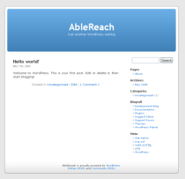
 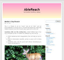 Default will look pretty funky for a while. Image floats and widths are areas where you will see rough spots. In most browsers, too-wide images are compressed to make them fit. IE6 users will see images wider than 450px protruding into the sidebar.